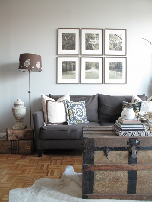
{I love the glamorous mix of accessories and textures in Chelsea’s entryway!}
The lovely Chelsea Watlington, who pens the blog, design 59 and works as an interior designer recently shared some gorgeous images of her New York studio apartment with me. I immediately loved the soothing color palette she had employed as well as her eclectic mix of accessories. What I found most impressive, however, was how amazingly stylish she had made this tiny space! So often, people have a tough time seeing past the constrictions that a small space might present. Chelsea, on the other hand, made the best use of the space in her apartment in Manhattan’s Seaport / Financial District, and made it feel super chic at the same time. Chelsea and I recently discussed how she went about designing a space that initially presented some challenges and where she turned for inspiration.

LDV: What were your initial thoughts when you decided upon your studio apartment?
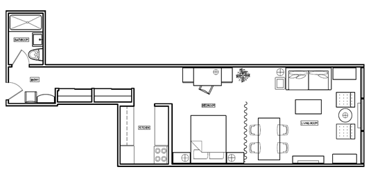
CW: Most would cringe at the idea of living in a studio, but I knew this space had potential the moment I stepped through the door. We quickly realized the space was larger than it appeared once we started placing furniture, and we decided not to put up a wall (although that was a possibility) in hopes of making the space feel more spacious than it actually is.

LDV: How did you go about defining each space within the apartment?
CW: The curtain is just enough to help divide the space while giving a softness to the room. And, the long hallway contributes to the overall spaciousness of the space, plus it makes a great gallery wall.
![IMG_2642[1] IMG_2642[1]](https://blogger.googleusercontent.com/img/b/R29vZ2xl/AVvXsEjLCQxF13PJNPo9Xd0iua8WzovQqeN_Yb4fm7uBgOqiI6ZdcTq41GCcQ_hXE_rL4dn6pqqMUlUfI-FHQUNf1QfRj5H-Cw6S5IpBaF0hDkEkouVZnNj67w1HRRnFBtCkDFPe-mWIVYQB8gvO/?imgmax=800)
CW: We chose to keep the bed closest to the kitchen so we could take full advantage of the view and keep the light out during those early morning weekends. The view is the main reason we picked this apartment. Not many people can say they can watch the sun rise over the Brooklyn Bridge every morning, and trust me...it never gets old.

LDV: What type of look were you trying to create in your home? How did you decide on the color palette you used?
CW: As a designer, I have endless products and materials at my fingertips which can lead to an indecisiveness when it comes to my own home. I’ve found the best way around this is by creating a neutral palette. This allows me to change the pillows and accents throughout the space and changing the feel without ordering new furniture. We rent in the city, so this neutral approach is perfect because it allows us to change paint colors and accessories to feel like we have a totally new space. The neutral palette is also very calming, which is a nice break from such a busy city. So, it was important to make this space relaxing but still be appealing from an overall aesthetic point-of-view.
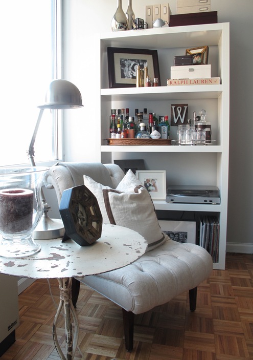
{I love the sleek IKEA bookcase next to the vintage pedestal table and slipper chair.}
LDV: Where did you turn for inspiration?
CW: I LOVE to find old things and make them new again. It helps the environment and is very cost effective. Several of the items in my home were found from flea markets or craigslist and re-upholstered to our taste.
{Doesn’t this look like the most inviting bed?}

Sources:
Sofa: Macy’s
Slipper Chairs: Found at a flea market and reupholstered
Rustic table between slipper chairs: Anthropologie
Bookcase: Ikea
Console: Antique store in Soho
Dining Table: Lillian August, CT
Dining Chairs: Cragislist - had them reupholstered and painted
Night Stands: Craigslist


